Using Tutorials
Introduction to the Tools Panel
ToolBar
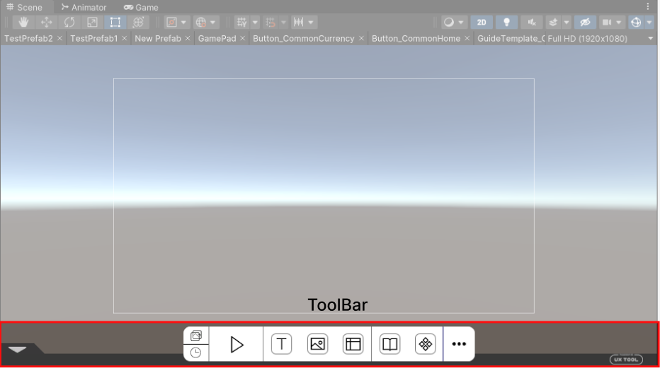
The ToolBar is a supplementary toolbar located at the bottom of the Scene panel, designed to facilitate rapid interface stitching. It can be enabled or disabled through the Unity top bar [ThunderFireUXTool - ToolBar].

Panel Functions
-
 Quick Background: Create a background for reference in the scene or Prefab. Then create the interfaces based on the quick background.
 -
 Recently Opened: Open the Recently Opened panel to see the most recently opened Prefab.
 -
 Preview: Preview the currently opened Prefab in the Game panel.
 -
 Text: Create a UXText object in the Scene or Prefab, and draw a checkbox of UXText by dragging and dropping.
 -
 Image: Create a UXImage object in the scene or Prefab, and draw a checkbox of UXImage by dragging and dropping.
 -
 Reference Lines: Create a set of reference auxiliary lines in the Scene or Prefab.
 -
 Widget Library: Open the Widget Library panel to view all components.
 -
 New Widget: Stow the currently selected node or Prefab as a component in the Widget Library.
 -
 More: Opens the Tool Information panel or the Settings panel.
Hide Panel
The open ToolBar can be hidden by clicking the small triangle button located on the left side of the ToolBar. To open it, click the same button again.
Top Toolbar of Scene
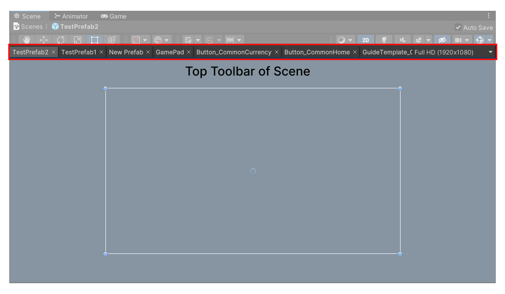
In the Scene panel, below the toolbar in Unity itself, a new UX toolbar is added to display the Prefab tab and adjust the resolution.

Prefab Tab
Each new Prefab opened by the user in the project is displayed as a tab in the toolbar. Clicking on a tab opens the corresponding Prefab directly.
When the number of tabs exceeds the display space in the toolbar, you can slide to display them by scrolling the mouse wheel.
Click the × sign of a tab to close the corresponding Prefab in the tab.
Adjust the Resolution
The rightmost part of the toolbar is the canvas resolution, which is always the same as in the Game panel. If one of them is modified, the other one will change as well.
Top Toolbar of Game
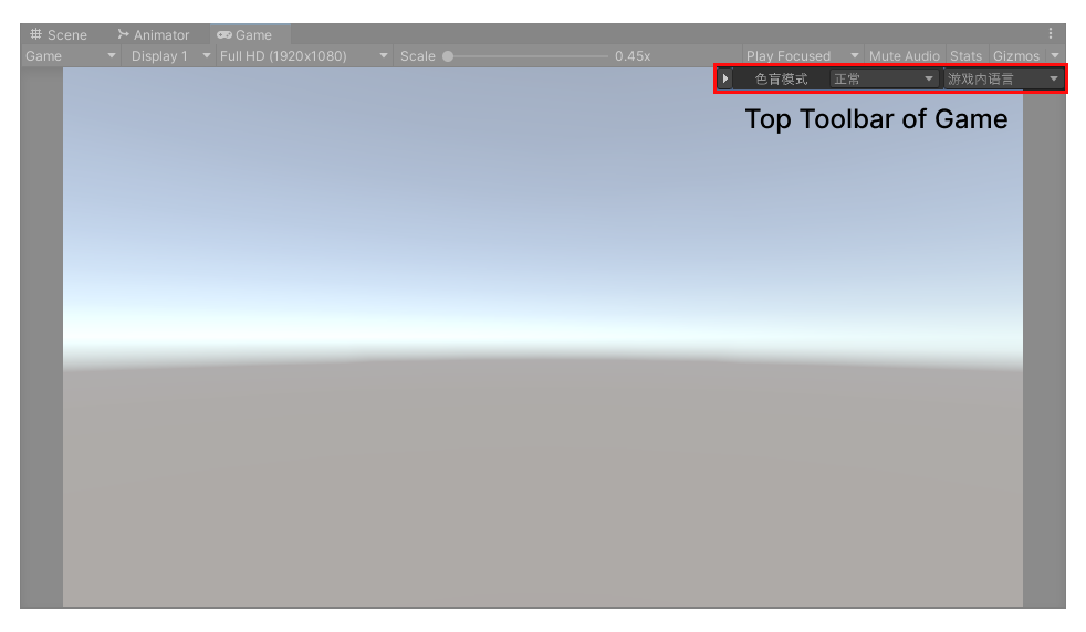
In the Game panel, a new UX toolbar has been added to the bottom right of the toolbar in Unity itself to toggle the content while the project is running. This toolbar can be collapsed by clicking the small triangle button on the left, and expanded when clicked again.

Color Blind Mode
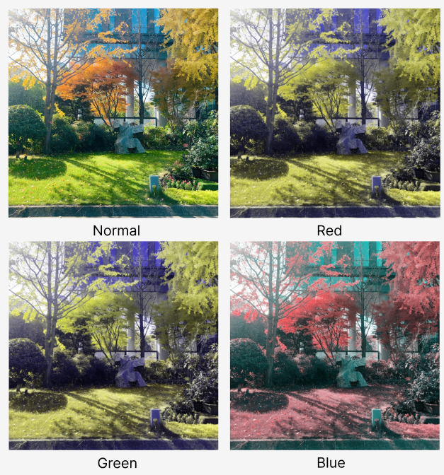
Adjust the color mode of the project in Unity to preview how the interface will appear for individuals with color vision deficiencies.
The default setting is normal, which reflects the appearance of the interface in standard states.
You can switch between red, green, and blue colorblind modes using the drop-down menu (refer to documentation on color blind mode for more information).

Switch Language
Preview how the project interface will look like in different languages. Check the language used in the project in Localization-Settings-Language to switch the corresponding language at runtime and see how the localized text and images appear in the interface.
The default language is the in-game language, i.e. the language initially used in the title. and the in-game language is prioritized to display at this time.
In addition, there are Text-Free Mode and Key Mode in the drop-down list:
-
Text-Free Mode: All the text in the interface is displayed in the form of placeholders, which is used to test the usability of the interface.
-
Key Mode: All the text in the interface is displayed as its corresponding KEY for quick location in localization assets.
(Refer to the localization function document for more details)


