マニュアル
Beginner Guide
ThunderFire UX Tool provides a complete set of Beginner Guide features, including onboarding editing tools and play mode feature, to help UI designers quickly style and adjust the Beginner Guide interface in the Unity editor and allow engineers to quickly integrate onboarding into their projects.
Terminology
GuideWidget A guide control that represents only one kind of guide effect, such as Hollow Highlightings, Gestures, Guide Text, etc.
GuideWidgetData Records various data in the GuideWidget. Used to save data for the guide interface edited in the editing tool.
UIBeginnerGuide A template for a guide interface that includes multiple different GuideWidgets.
UIBeginnerGuideData Records various data in the UIBeginnerGuide. Includes Guide ID, Guide Type, Guide Duration, Guide Template, and GuideWidgetData included in the UIBeginnerGuide (see Parameter Details below).
UIBeginnerGuideDataList A guide list that includes a group of UIBeginnerGuideData. After one of the guides in the list is completed, the next guide in the list will be automatically activated until the entire guide list is completed.
How to use
1.Create The Guide Data List
Select a node in the Ccene or Prefab (usually a persist object), Click [ThunderFireUXTool-Create-Create BeginnerGuide] in the top menu bar. This will add a UIBeginnerGuideDataList component to the object, which represents a sequence of guide steps. Alternatively, you can manually add this component via the Inspector panel.

2.Create New Guide Steps
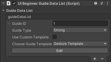
The Guide Data List is empty by default. To add a new guide step, click the "+" button in the UIBeginnerGuideDataList component. To configure the guide step, you can use a preset template or a custom template. Here, we will use a custom template. (You can refer to the section "Creating a Custom Guide Template" below.)

3.Edit GuideData List
Click the [Edit] button to create a guide editing panel in the Hierarchy window. The objects that can be edited will be displayed in green. Additionally, a guide bar will appear in the top left corner of the Scene, displaying the Guide ID, Preview, Save, and Close buttons.
The guide editing panel is a temporary object that is instantiated from the "Guide Template", and is only provided as a visual editing tool. It will be deleted if you switch scenes, start running play mode, or click the close button.

Edit the Hollow object. Click on the "Hollow Component" object in the Hierarchy and configure it in the GuideHighLightData component as shown:
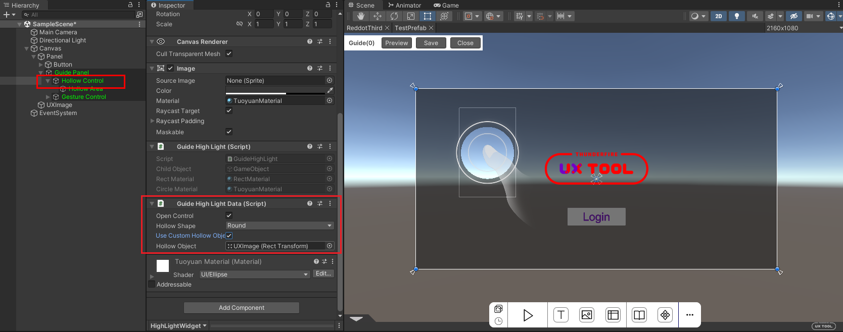
The above steps are to select "Round Hollow" and the hollow object is "UXImage" (i.e. the UX Tool image in the figure). After editing is complete, click the "Save" button in the guide toolbar to save your changes.
To edit the Gesture component, open the guide editing interface and select the "Gesture Component" object. In the GuideGestureData component, configure the settings as shown in the picture:

Add a guide animation for a tap gesture on the UXImage (i.e. the UX Tool image in the picture) object. After editing is complete, click the "Save" button in the guide toolbar to save your changes.
4.Preview Guide
Click the Preivew button in the Toolbar to see the hollow highlighting and gesture animation effect you just edited.

Note: Because the hollow and gesture configurations have just been configured to follow the UX Tool image, the guide effect will also be automatically positioned when the UX Tool image position changes.

5.Guide At Play Mode
To properly display the guide content at play mode, the scene must include the UIBeginnerGuideManager component. Add the UIBeginnerGuideManager component to the Canvas object in the scene, and all guide interfaces will be loaded under this Canvas. The UIBeginnerGuideManager is a singleton object, so only one is required globally.

In addition, there should be a program script to control the timing of the Beginner Guide's playback (the specific interface can be seen in the Program Interface below). In the ShowGuideMono script example in the sample, two operations are executed: adding the UIBeginnerGuideList to the Manager and then playing the guide in the Manager.
The guide created by the UIbeginnerDataList component will determine the end condition based on the type of guide, and automatically open the next guide in the group until there are no more guides in the group.

Parameter Details
Guide Parameters
-
Guide ID: Used to distinguish the names of different guides, generated by default, can be modified according to the content of the guide.
-
Guide Type: must be used with the skeleton component, and only clicking on the skeleton area will end the guide.
- Strong Guide: must be used with the skeleton component, and only clicking on the skeleton area will end the guide.
- Medium Guide: Click anywhere on the screen to end the guide.
- Weak Guide: Automatically ends guide after a period of time.
-
Guide Duration: When the guide type is weak, sets the duration of the guide. This setting is not applicable for other guide types.
-
Use Custom Template: Specifies whether to use a custom guide template. Selecting this option displays the "Guide template" property, while unselecting it displays a dropdown menu for choosing a guide template.
-
Guide Template: Specify a custom guide template.
-
Choose Guide Template: Choose from preset guide templates provided by the tool.
Preset Guide Controls
Hollow Contol
Used to add a color mask to a scene or interface and hollow the guided content for display.
-
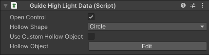
Open Control: Control switch, selected by default.
-
Hollow Shape: You can choose square or round as the shape of the hollow area.
-
Use custom hollow object: Hollow objects can be used by default or customized.
-
Hollow Area: Determined by whether to check the use of custom hollow objects.
- If not selected, the control's built-in hollow area object is used. Click the "Edit" button of the hollow object to directly edit the size and position of the hollow area in the scene.
- If selected, other UI objects in the scene, such as buttons and images, can be dragged and dropped as hollow objects. The hollow area will automatically recognize the size and position of the object and will be visible at play mode.
Gesture Control
Provide commonly used gesture guide presets with animations and customization options.
-
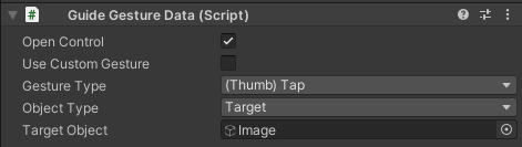
Open Control:Control switch, selected by default.
-
Use Custom Gestures: Gestures can be default or customized.
-
Gesture type: Determined by whether Use Custom Gesture is selected.
- If not selected, the default gesture presets are used, and the desired gesture type can be selected directly from the drop-down list.
- If selected, drag and drop gesture objects made by the project itself.
-
Drag Curve: This parameter is displayed when the gesture type is drag. At this time, there will be a start marker and an end marker for the drag gesture in the scene, which is used to set the starting point of the drag gesture. At the same time, adjusting the drag curve can adjust the drag animation.
-
Object Type: The objects that can be guided by gestures can be either customized or targeted. For customized objects, the gesture can be dragged to the desired guide position in the scene. For targeted objects, other objects in the scene can be selected to be the guided object.
-
Target Object: Show this parameter when the object type is targeted. Other UI objects in the scene can be dragged as the guided object of the gesture. At this time, the gesture will always follow the position of the object.
Text Control
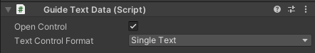
Provide basic text objects to be used as guidance tips.
-
Open Control: Control switch, selected by default.
-
Text Control Format: Optional text control with or without title, with two options: single text and text with title.
Emphasis Control

Use the emphasis box to frame the lead content for emphasis.
-
Open Control: Control switch, selected by default.
-
Emphasis Type: You can choose square or round as the shape of the emphasis box.
-
Object Type: The object to be emphasized can be customized or targeted. For customized objects, the emphasis box can be dragged to the desired position in the scene. For targeted objects, other objects in the scene can be selected as the emphasized object.
-
Target Object: This parameter is displayed when the object type is targeted. Other UI objects in the scene can be dragged and selected as the emphasized object. The emphasis box will then always follow the position of the selected object.
-
Play animation: Whether to play the fade-in and fade-out animation of the emphasis box.
Game Pad Control
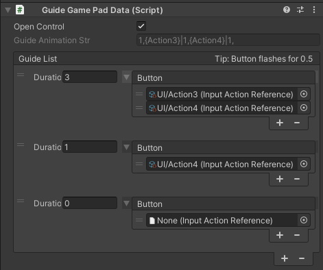
Provides game pad guidance.
-
Open Control: Control switch, selected by default.
-
Guide List: A sequence of button animation guides. Click the "+" icon to add a new guide, and select an existing guide and click the "-" icon to delete.
- Duration: The display duration of the guide, which is 0.5 sec for each flash of the button.
- Button: The button corresponding to the guide. Multiple flashing buttons can be set simultaneously. If no button is set, it will not flash by default.
Preset Guide Templates
When editing the guide, you can select the preset guide templates provided by the tool, including the gesture template and the game pad template, which consists of the above guide controls.
Gesture Templates
The gesture template contains hollow controls, gesture controls, emphasis controls and text controls. When using the template, you can turn on or off various controls and adjust their parameters as needed, and save them to take effect.
Game Pad Template
The gesture template contains skeleton controls, handle controls, emphasis controls and text controls. When using the template, you can open or close various controls and adjust the parameters in them as needed, which will take effect after saving.
Create Custom Guide Templates
Step 1 Create a new UI Prefab named it GuideTemplate_XXX, XXX can be any name (here it is named GuideTemplate_Test), add UIBeginnerGuide component to the root object of this Prefab.
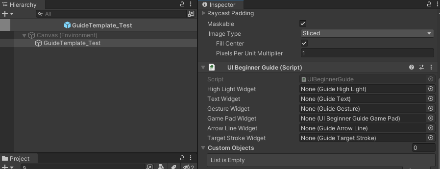
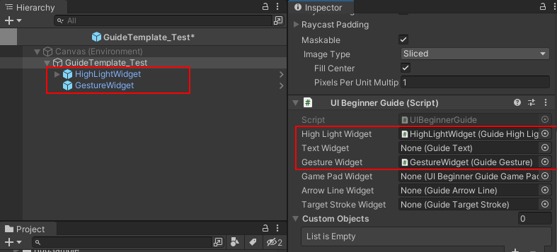
Step 2 In the folder of preset controls, add the guide controls as child nodes of the Prefab according to the requirements, and bind the corresponding widgets in the UIBeginnerGuide component. Here, we add two common types of guides: Hollow and Gesture.
Default folder path for preset controls: Assets/UXTools/Res/UX-GUI-Feature/BeginnerGuide/Res/Prefab/BeginnerGuideWidget
Step 3 Save the Prefab so that a guide template is created and the usage is the same as defining a template.
Program Interface
Variables
// instance of UIBeginnerGuideManager
// Class:UIBeginnerGuideManager
public static UIBeginnerGuideManager Instance;
Function
// To use the following function, you need to get UIBeginnerGuideManager.Instance and then use it

// Description: Adds a boot to the boot list queue
// Class:UIBeginnerGuideManager
// Parameters:
//     datalist: the boot object to add
// Return value: None
public void AddGuide(UIBeginnerGuideDataList datalist)

// Description: Set the next boot list to start with the boot item whose name is id
// Class:UIBeginnerGuideManager
// Parameters:
//     id: the id to be played next time the guide is played
// Return value: None
public void SetGuideID(string id)

// Description: Play the first boot list
// Class:UIBeginnerGuideManager
// Parameters: None
// Return value: None
public void ShowGuideList()

// Description: Play the specified list of guides
// Class:UIBeginnerGuideManager
// Parameters:
//     datalist: the boot list object to be played
// Return value: None
public void ShowGuideList(UIBeginnerGuideDataList datalist)

// Description: Play the specified ID from the specified boot listD
// Class:UIBeginnerGuideManager
// Parameters:
//     datalist: he boot list object to be played
//     id: the id to be played next time the guide is played
// Return value: None
public void ShowGuideList(UIBeginnerGuideDataList datalist, string ID)

// Description: Ends the current boot
// Class:UIBeginnerGuideManager
// Parameters: None
// Return value: None
public void FinishGuide()

// Description: ends the boot of a certain ID (if the current boot is not that ID, the function is invalid)
// Class:UIBeginnerGuideManager
// Parameters:
//     guideID: the guide ID to end
//     Return value: None
public void FinishGuide(string guideID)

// Description: Clear all boot sequences in the list
// Class:UIBeginnerGuideManager
// Parameters: None
// Return value: None
public void ClearGuide()

// Description: Clearly list the specified boot sequence
// Class:UIBeginnerGuideManager
// Parameters:
//     dataList: the boot sequence to be deleted
// Return value: None
public void ClearGuide(UIBeginnerGuideDataList dataList)
